Blog Archive

Monday, 23 April 2012

Final Submission Assignment 2

The materials used in the house are really interesting. Gehry built the home in the 70s, when in Santa Monica there was this left-wing political movement known as progressivism, which encouraged self expression. So the location was ideal for Gehry to experiment with material and form.
The most interesting materials include chain-link fence wire, corrugated iron and exposed studwork.
Gehry said that "a structure in progress is always more poetic than the finished product", and so these material choices and forms are supposed to reflect this.
Fencing wire and corrugated iron are materials used usually in commercial or public places.
Although it appears aggressive on the home, the fact that these materials are so open to public use [i.e fence wire on bball courts and parks], and indicates that perhaps Gehry wanted to create an image which could connect with society.
-public areas. The new addition has asphalt flooring; all these materials used the public ‘domain’ support this suggestion by Gehry that the structural process is so poetic. It appears in many senses incomplete; such industrial appearances are not the definition of the traditional home, which is part of the success of the architecture.
-private areas are far more refined, however maintain raw textures. All materials in these areas allow a sense of comfort within the spaces. It is so difficult to define how a space is used. On the exterior of the upper level chain link wire is used to create a transparent outdoor area where the person feels entirely protected.
Public vs. Private
I've got two main parts on the poster, and a model. I'm looking at how I would classify each section of the house, how you move between each area and how each set of areas is set out. What i found was an extremely clear result; as you move left the house becomes more private and more compartmented.
The four major parts are:
Yellow represents the addition; it is one fluid space which is entirely public. Despite its abstract physicality, its plan is modern and open-plan.
Orange represents the semi public/private area, which consists mainly of the lounge room, sitting rooms and veranda. All these are single spaces as well, usually boasting a larger area.
Blue represents the buffer between public/private. This principally involves passageways. They are very important spaces however in this design have inconsistent patterns.
Green represents the private sections of the home. They are the most compartmented areas. It is not open plan. The most significant sense of openness provided in these areas is the ‘open’ ceiling...private yet open feeling.
With the model im looking at this visual connection between different areas, which is most present on the ground floor. There is this extremely strong connection between street-kitchen, and then kitchen-loungeroom. The spaces only flow visually though; there is no easy physical flow between the areas. This adds to the privacy of areas such as the loungeroom, which i categorise as semi-public. It also really sums up this idea that as you move inward the house becomes more private.

In terms of psychology, ive really focussed on how light and the size of spaces in the home influence how the person experiences a room. The results i found was the the psychology of the home was closely related to the previous studies...different materials influence how you are going to use the home...
The privacy study i concluded that spaces became gradually compartmented with their levels of privacy, and this is highly significant to the manner which a room is going to connect with you.
The model ive made is to represent this idea...this shows four major sections...the kitchen, the loungeroom, the bedroom, the veranda. Each is colour coded according to light, and has appropriate openings.

Portfolio of Progression; post break


Contextual Map; Understanding the grid pattern of Santa Monica. I wanted to look at how the materials selected may be influenced by the patterns of suburbia.

Understanding how light and space influence how the person feels in a space, and how they choose to use it.

Portfolio of Progression: Interim Submission


Monday, 12 March 2012

2012 Design Studio Project One: Gehry Santa Monica


Ground Floor Plan:


First Floor Plan:

Sections:

Structural Floor Plans and Sections:
The majority of the load is carried through the original house. The original dwelling is in no way reliant upon the alteration.


Relationships:
There are three distinct spatial relationships within the house: private spaces, public spaces provided by the original architecture, and public spaces provided by the addition. Private and public areas are linked by smaller, semi-private areas.
Green: Public spaces in original home [lounge areas].
Orange: Public spaces provided by addition [functional areas].
Dark Blue: Private areas [bedrooms, en suites]
Light blue: Semi-private areas [bathroom and/or foyer, located between public and private areas].

Circulation of the house is quite clear.
Blue: indicates the path a person may take who seeks to use the house functionally. That is, they may wish to use the kitchen, or access the backyard. This is all provided through one clear space, in the new addition.
Green: Indicates the path a person may take who seeks comfort. That is, they would want to use areas such as a lounge-room to relax. These areas are hidden within the old home, however are for more exposed than the private areas located around it.
Brown: Indicates the path a person may take who seeks privacy. They enter the home and, in general, will move upstairs and into a bedroom. Access is easy, however perhaps not as inviting as the two public spaces aforementioned.
Landscape:
The home sits distinctively on a suburban corner block. Gehry’s wish to create a symbol of deconstructivism is powerfully expressed through a dramatic metal facade, and skewed windows. There is a stark juxtaposition between the house and the streetscape. Yet, traditionally, it defines the corner of the block well, and retains some order to the Santa Monica grid.
Vegetation softens the architecture, and provides an appropriate level of privacy for a building which so adamantly seeks to connect with the street.

Monday, 24 October 2011

DRAW-IT

Poster


Elevations


Elevation

Axonometric
Sectional Axonometric

MONTAGE-IT!


poster [above]

 Night montage:
 Day montage:

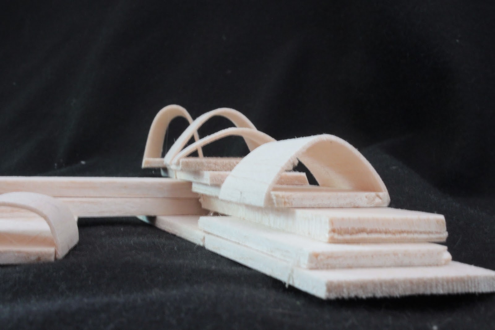
The concept models, based on Andy Goldsworhty's 'The Wall'